The 2020 Social Venture Brand Awards.
Honoring the best nonprofit & social enterprise brands of the past year

KEVIN L. BROWN
There are countless awards to honor social venture innovation and impact — from Skoll to Schwab. But even with impactful products and programs, most social ventures can’t bring in enough revenue to grow.
So we wanted to recognize organizations doing an exemplary job positioning their brands, clarifying their message, aligning teams, and reaching new audiences. Which ultimately leads to more income from funders and customers. And the ability to grow in a sustainable way.
Our three judging criteria.
Winners must be a nonprofit or social enterprise. Legal entities aside, they’re all mission first!
Awardees should be (mostly) growth-stage social ventures — not big nonprofits or corporations.
Nominees can’t be a client of Mighty Ally. Nobody likes self-promotion.
We chose eight categories, with a winner and runner-up in each. And the nominees are…
Best theory of change.
Recognizing ventures that have clearly articulated the need, work, and results in their model. No matter the format, these brands have used a tool to clarify their message, drive focus within the organization, and create confidence with funders.
WINNER — SPARK MICROGRANTS
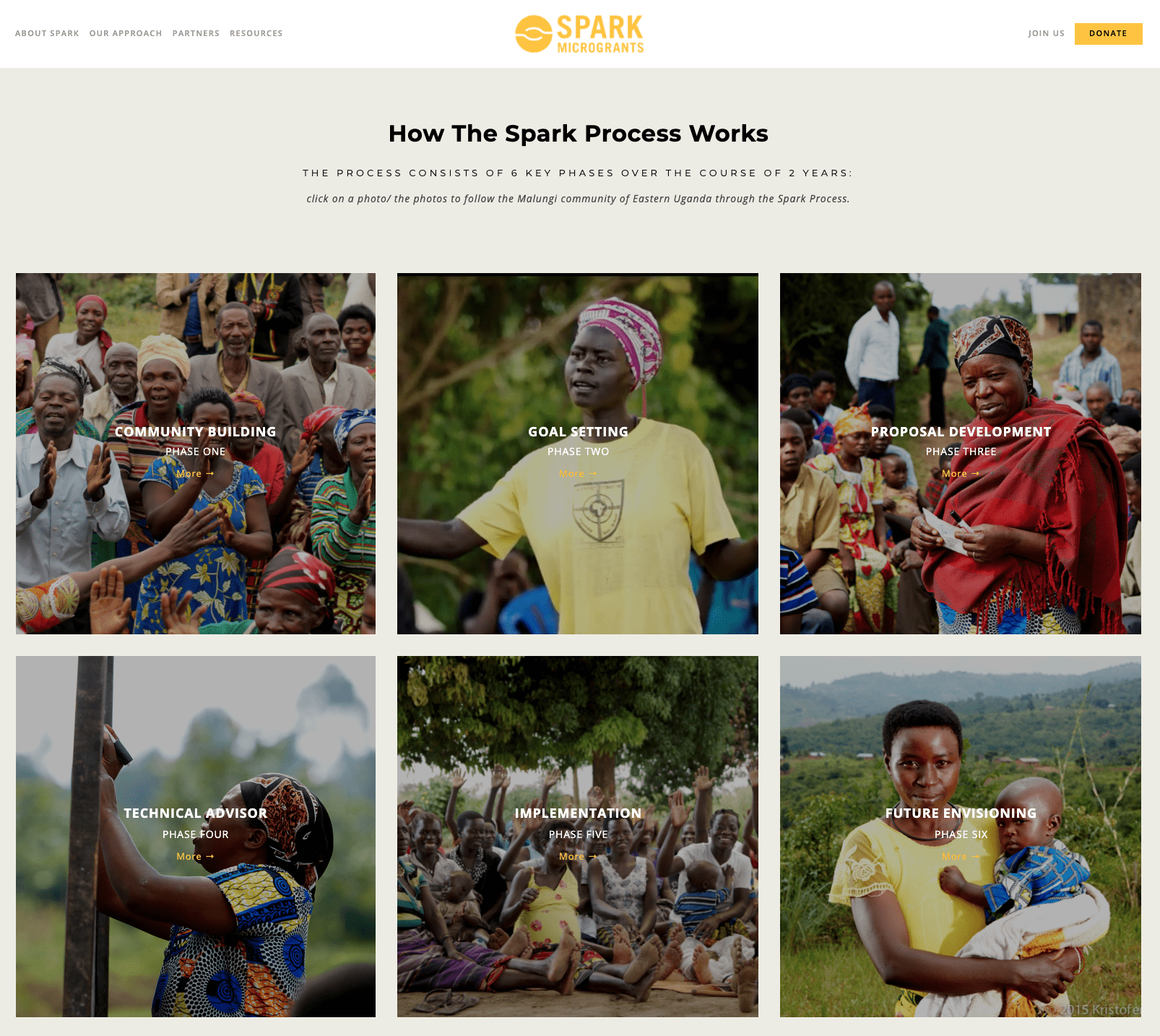
Like many organizations, Spark has undergone evolutions in its 10 years. Despite that flexibility, we love the rigidness of The Spark Process. Not only does it promote a Community Driven Development approach, it’s also mapped into six key phases over two years. With specific steps and community examples for each phase — all tying back to their theory of change.
Spark excels at defining their unique means of getting from here, to there. Equally impressive is how they define who they are not. And the way they openly declare their reliance on partners to execute their impact model.
RUNNER-UP — HEALTHY LEARNERS
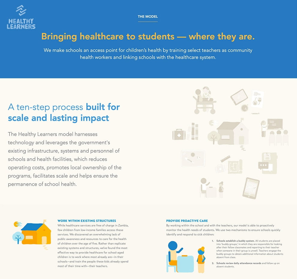
Here’s another solid theory of change, this time in a 10-step framework with descriptions anyone can understand. But Healthy Learners doesn’t hide behind their high-level website language like, “We train teachers as community health workers.” For many of the steps, they link off to further details on how it works.
No wonder their impact is so strong — by the numbers, in studies, and through stories. And no surprise they’ve attracted some of the best funders in the world. This demonstrates that knowing exactly who you are, why you exist, what you do, and where you’re going (the underpinnings of a brand) leads to success.
Best positioning strategy.
Honoring brands with clear audiences, value props, and bold personality. They’ve gone through the deliberate, strategic process of identifying strengths, assessing gaps in the landscape, and choosing how to present their brands in the market.
WINNER — BLACK LIVES MATTER
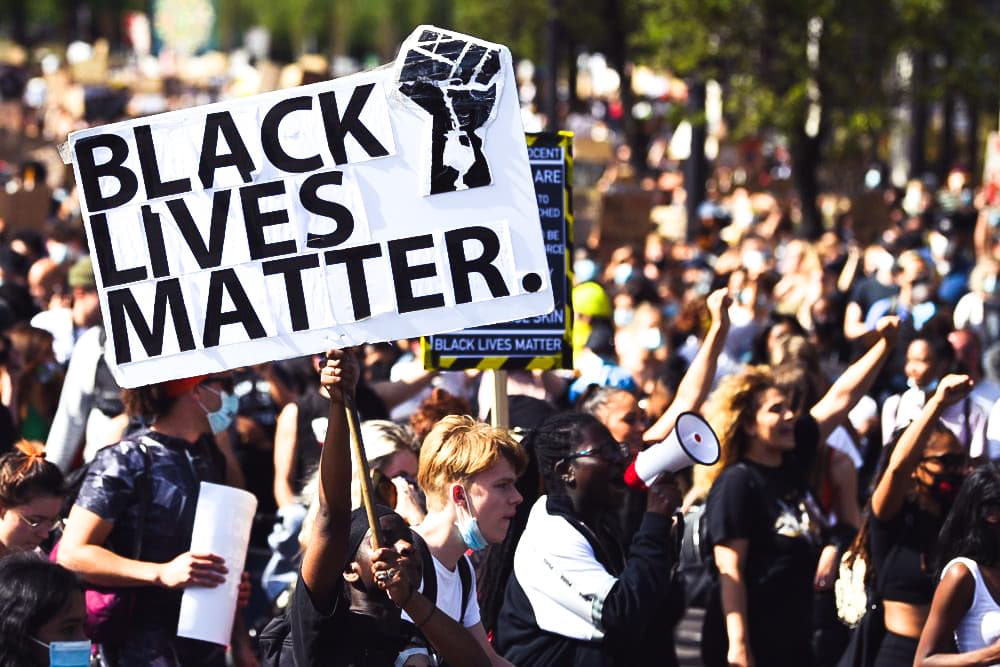
Good positioning comes with a keen understanding of the landscape. And then pivoting or banking off changes or disruptions. Black Lives Matter found a way to respond to the crescendo of racial violence that erupted last summer. And in the process, it became the largest social movement in U.S. history, sparked billions in fundraising, and cemented itself as a household name globally.
Credit goes to BLM for the courage to turn off as many as they turned on to the cause. They even publicly state this stance in their 13 Guiding Principles — “We are unapologetically Black in our positioning. In affirming that Black Lives Matter, we need not qualify our position.”
RUNNER-UP — EDUCATE GIRLS
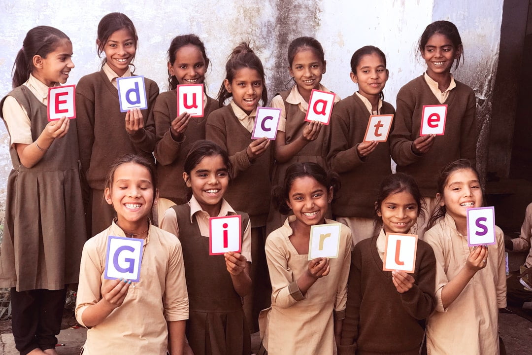
Indian nonprofit Educate Girls gets a nod for tight focus among the education cacophony. This positioning bravery influences everything from their name to their visual identity. The brand clearly targets funders and government partners. And makes great use of promises to communicate value to each audience.
Kudos also for ensuring alignment around this positioning. A job description for a Comms Officer didn’t list fundraising or content first. No, the primary responsibility was to manage the brand image and positioning, maintain consistency in messaging, and induct new recruits into the brand. That, ladies and gentlemen, is how positioning strategy comes to life.
Best marketing comms.
Applauding nonprofits and social enterprises with actionable strategies to amplify their story in a clear, compelling way. These brands use marketing communications channels to reach new audiences, then turn them into supporters and income.
WINNER — COTOPAXI
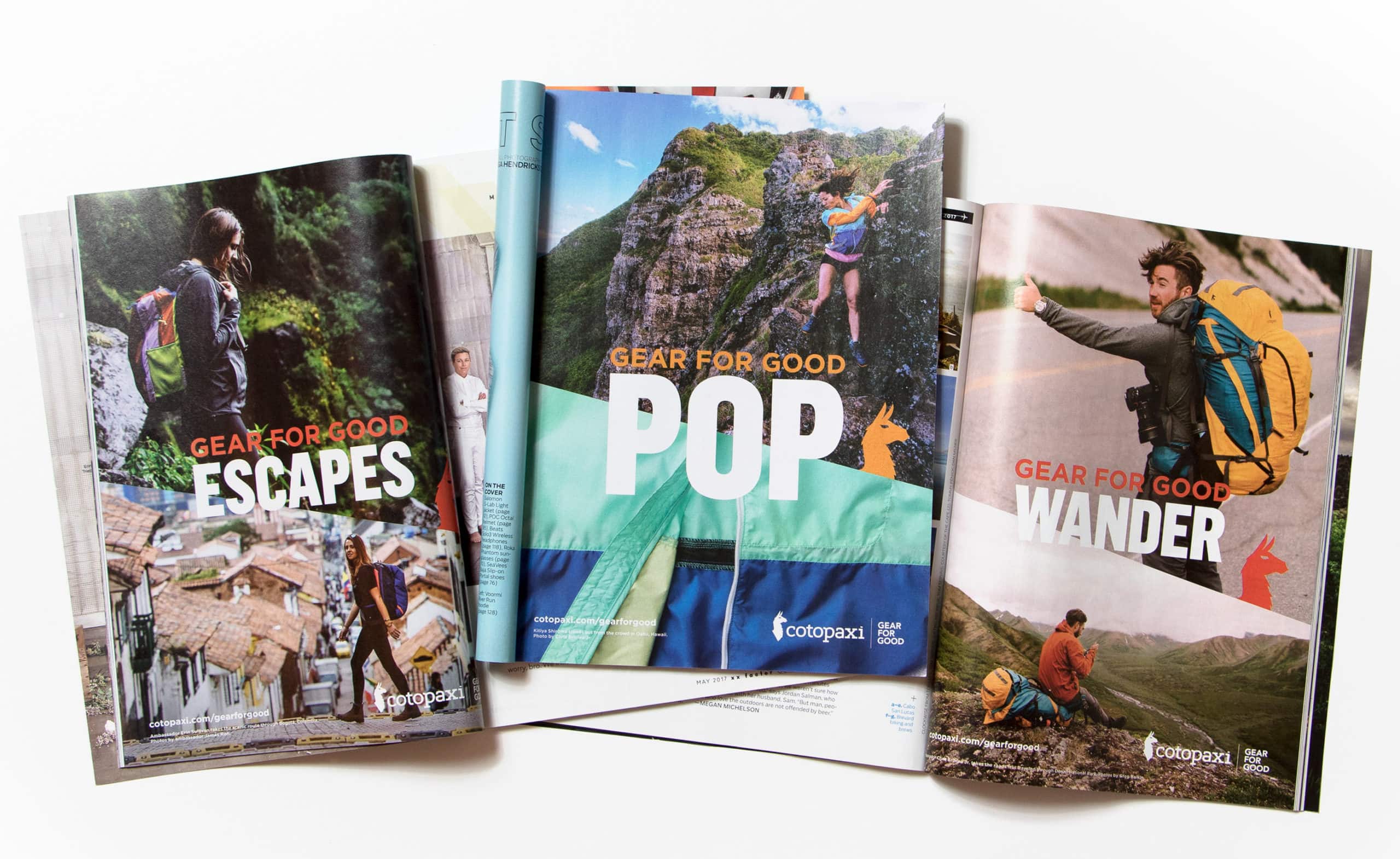
This B Corp + nonprofit outdoor brand knows their audience. They reach the right people in the right places at the right time with the right message. Cotopaxi uses social media to engage their 200,000 followers with smart content like the #DoGoodChallenge and Giving Guide. And they keep fans connected to the impact from partners like International Rescue Committee and Mercy Corps — lending credibility to their marcom mix.
Not to mention their visual identity is just beautiful and on point. Cotopaxi’s commitment to visual consistency — evident in their social feeds and product design — makes their brand especially resonant.
RUNNER-UP — GRASSROOT SOCCER
Companies of all types struggled in 2020 when trusty marcom channels disappeared overnight due to COVID-19. Events, direct mail, and in-person fundraising were impossible much of the year. Some orgs retreated and licked their wounds. Others innovated and advanced — like adolescent health organization Grassroot Soccer.
In December, GRS shifted their annual World AIDS Day Gala online. They broke through the Zoom noise by recruiting world-class athletes, a Nobel Prize winner, top-notch entertainers, and global health leaders. And they raised more than $1 million in a single night, showing that good marketing communications can convert even during a pandemic.
Best messaging.
Celebrating social ventures with a compelling style for written and verbal comms. They’ve turned positioning into wording that articulates what they do and why the world should care — with consistent messaging from digital media to internal comms.
WINNER — MIJENTE
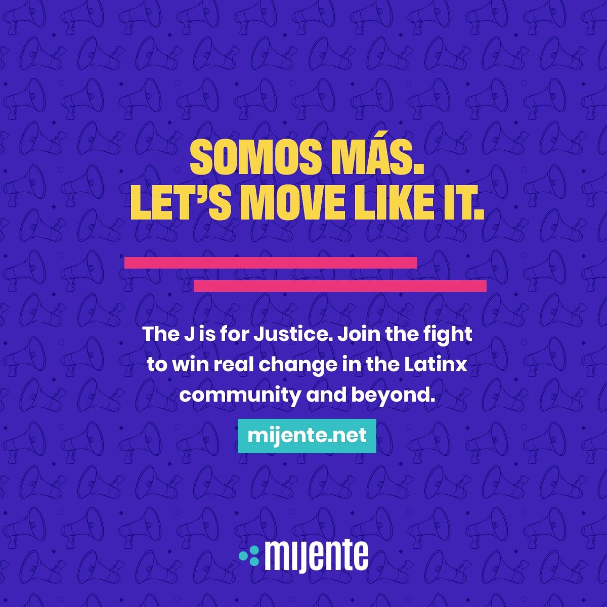
For inspiration on how to use words to capture hearts and minds, look no further than Mijente — a movement-building network that advocates for Latinx justice. Most impressive is their mixed-use of Spanish and English throughout their brand. Their copywriting truly embodies their lived experience. Assimilation through English, while holding onto the language of their homeland. A reminder that messaging isn’t just what you say, but how you say it.
Mijente also wins for bold, in-your-face headlines. They’re not afraid to be evocative — “It’s said that if you’re not at the table, you’re on the menu — or they expect you to pick, cook and serve the food.” They incite camaraderie vs. destruction via calls to action. And on pages like Our DNA with their seven principles of unity, Mijente further uses savvy copywriting to bring you into the cause.
RUNNER-UP — NOORA HEALTH
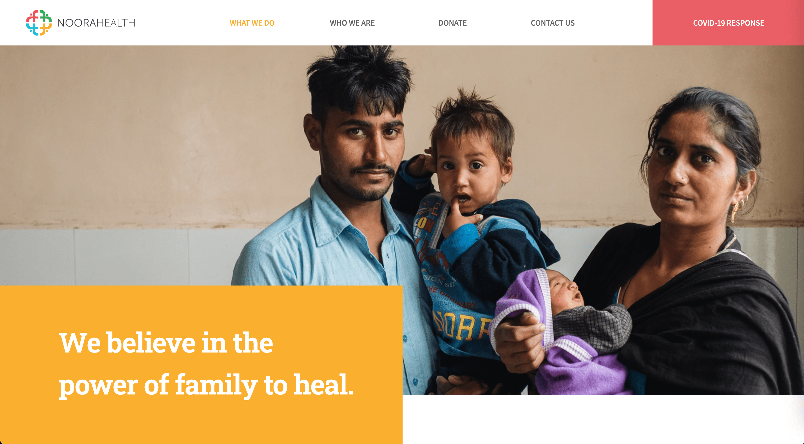
Kudos to Noora Health for their long-time tagline, “We turn hospital hallways and waiting rooms into classrooms.” And hats off for their consistently punchy, effective messaging. They’re not afraid to tackle tough subjects in their language, like the “power imbalance in our global healthcare system.”
Even with a complex model, it’s easy to grasp immediately what they do and why it’s unique. But good content alone can’t move funders, donors, and partners. Noora Health roots their messaging in strong positioning — and an equally sound theory of change.
Best visual identity.
Saluting brands who have taken their brand personality and created a distinctive look and feel. More than just a logo and colors, they have a visual identity that extends into every brand touchpoint — from public-facing materials to products and services.
WINNER — ALIVE AND KICKING
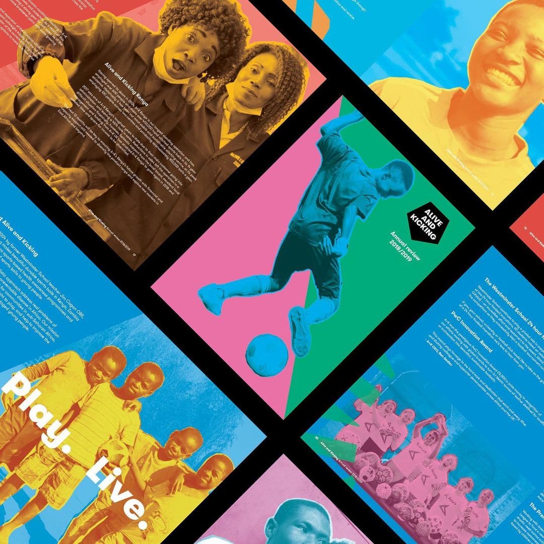
If not for the donate button, you might not know Alive and Kicking is a social venture. Big thumbs up to London-based design agency, Fourfeet, for creating this one-of-a-kind visual identity and web design. The beauty of the brand identity is how it visually reflects the organizational strategy. Brand elements — from the logo shape to the vibrant colors — clearly nod to the energy of the sport. Combined with the humanity of its community, centering the photography of people in an electric way.
This is not just a charity with a nice website. The unique visual identity extends into the product too. And holds strong on their regular giving program as well. You get a contract, jersey, football, and merchandise when you give monthly. Case made for brand driving income.
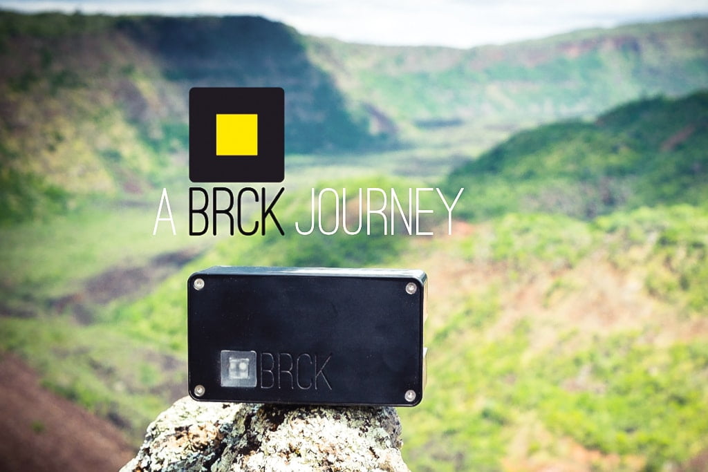
RUNNER-UP — BRCK
Kenyan social venture, BRCK, is worthy in multiple categories. Clarity of model and mission. Superb messaging. And top-notch website strategy. But we give them props for an outstanding visual identity.
Simple, unique colors really show well on an equally minimalist website. And their bold brand personality comes through strongly via good photos to augment the visual design. Not to mention the brand’s excellent visual identity extends well into product design. The devices themselves are designed with classic BRCK style — sleek, modern, and rugged all at the same time.
Best website strategy.
Commending nonprofits and social enterprises that have applied their deeper brand work to their most important asset: the website. These sites don’t just look good — they convey complex information and aid multiple user types in achieving their online goals.
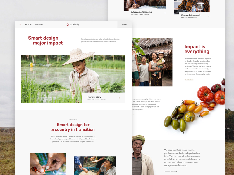
WINNER — PROXIMITY DESIGNS
It’s refreshing to see a social business elevate its web presence to rival the sophistication of its for-profit peers. Proximity Designs makes you stop and appreciate both their offline work and online experience. The pop-up asking for feedback shows the team’s commitment to ongoing optimization. When user and technology trends shift constantly, Proximity demonstrates that the best web strategy is dynamic, never static.
There’s a lot to like about this site. Simple navigation and clear user paths. Smart information architecture. A slick combination of illustration and photos. Lots of white space. Just enough animation to keep things interesting.
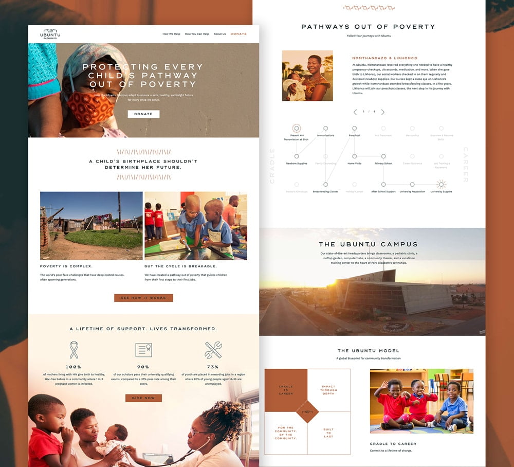
RUNNER-UP — UBUNTU PATHWAYS
Ubuntu provides an integrated system of health, education, and social support in the townships of South Africa. It’s not easy to convey that kind of programmatic breadth and depth (plus 20-years of history) on a single website. But instead of shying away from this holistic model, they lean into it. And even state it outright — “There is no single solution. It takes everything, every day.”
Great headlines communicate the model well. They make use of interactive elements — like the four pathways out of poverty — to convey complex interventions. There’s compelling photography and video to aid understanding. The color palette is distinctive. You’ll see minimal copy and a simplified sitemap. Then large calls-to-action and multiple ways to support on the How You Can Help page.
Best corporate activations.
Lauding social ventures that have activated the power of private-sector partnerships. Beyond philanthropy, they’ve used corporate relationships for their teams, product, and platform. Meaning more funding, people power, awareness, and in-kind gifts.
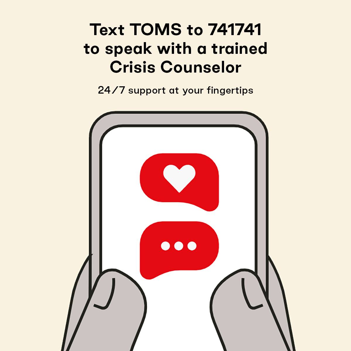
WINNER — CRISIS TEXT LINE
This social venture has an entire discipline around corporate partners. And sees the benefits of philanthropy and people from the likes of Netflix and Hershey. They’ve received platform and product benefits from Verizon, Sprint, AT&T, and T-Mobile. The best part is that these corporate brands are driving awareness and usage back to Crisis Text Line.
Corporate partners can help social ventures in more ways than money. This is a marcom channel just like any other. But the best partnerships are those that provide value in both directions. Crisis Text Line touts the clear value they provide in return for sponsorship: important mental health support. Proving that corporate engagement isn’t just top-down. And while social ventures might not have much capital, they deliver essential value in return.
RUNNER-UP — NEW STORY
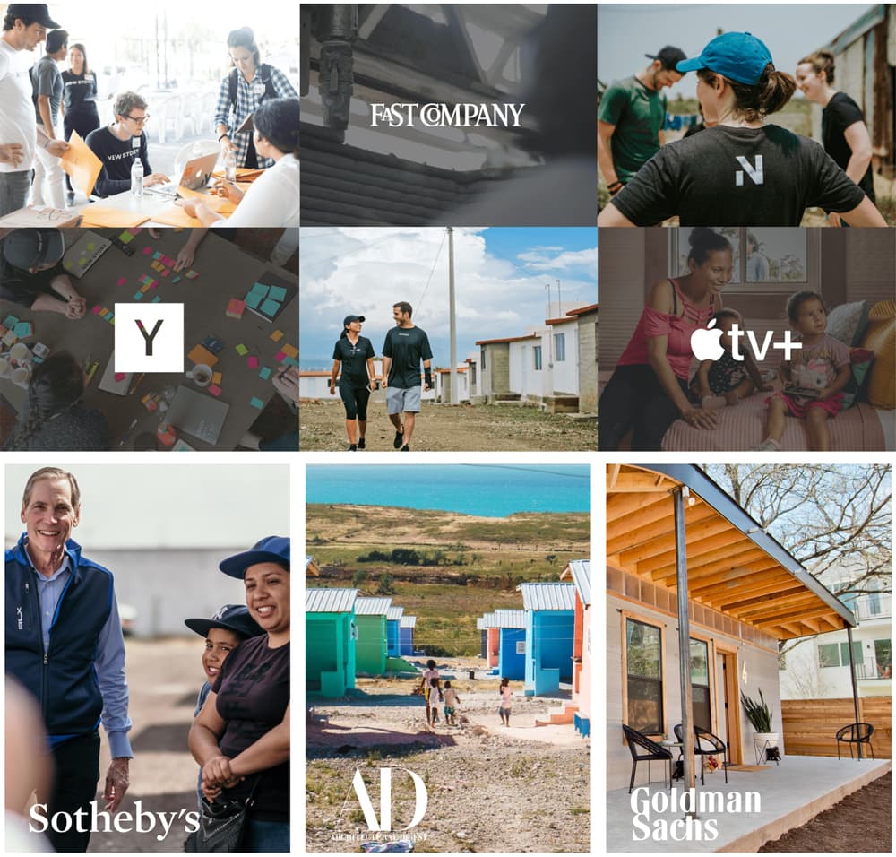
Private-sector supporters have become a key pillar of the New Story brand, as featured on their website. New Story has received philanthropy through Sotheby’s and Goldman Sachs. They’ve activated people through consulting firm L.E.K.. And driven product innovation and platform gains via Architectural Digest.
When a corporate partner brand is also a media outlet, like AD, social ventures get extra amplification. In this story, it’s easy to see how a true partnership can drive income and impact well beyond a typical media hit. And when partners like DocuSign issue press releases about you, it’s apparent the New Story brand is seen as reciprocally valuable.
Best strategic planning.
Commemorating nonprofits and social enterprises who know that brand building matters just as much inside the organization as outside. They’ve aligned their brands across leadership, people, priorities, rhythms, and data — turning visions into traction.
WINNER — BUILDING TOMORROW
Sure, Building Tomorrow has a clear theory of change and unique positioning in a crowded space. This is the side of the brand the world sees. But behind the scenes, they’ve done a great job aligning the brand internally as well — from global leadership to in-country teams.
Their About page is full of the kind of organizational clarity the best business books preach — values, strategic anchors, and data. And just look at this Instagram quote — it mirrors our assertion that your brand is not just what you say, but also what you do. When Building Tomorrow pitches their vision to a funder, there’s no doubt the traction is in place to back it up. And the 15 years of steady growth is a testament to its strategic planning.
RUNNER-UP — FELEK NOTEBOOKS
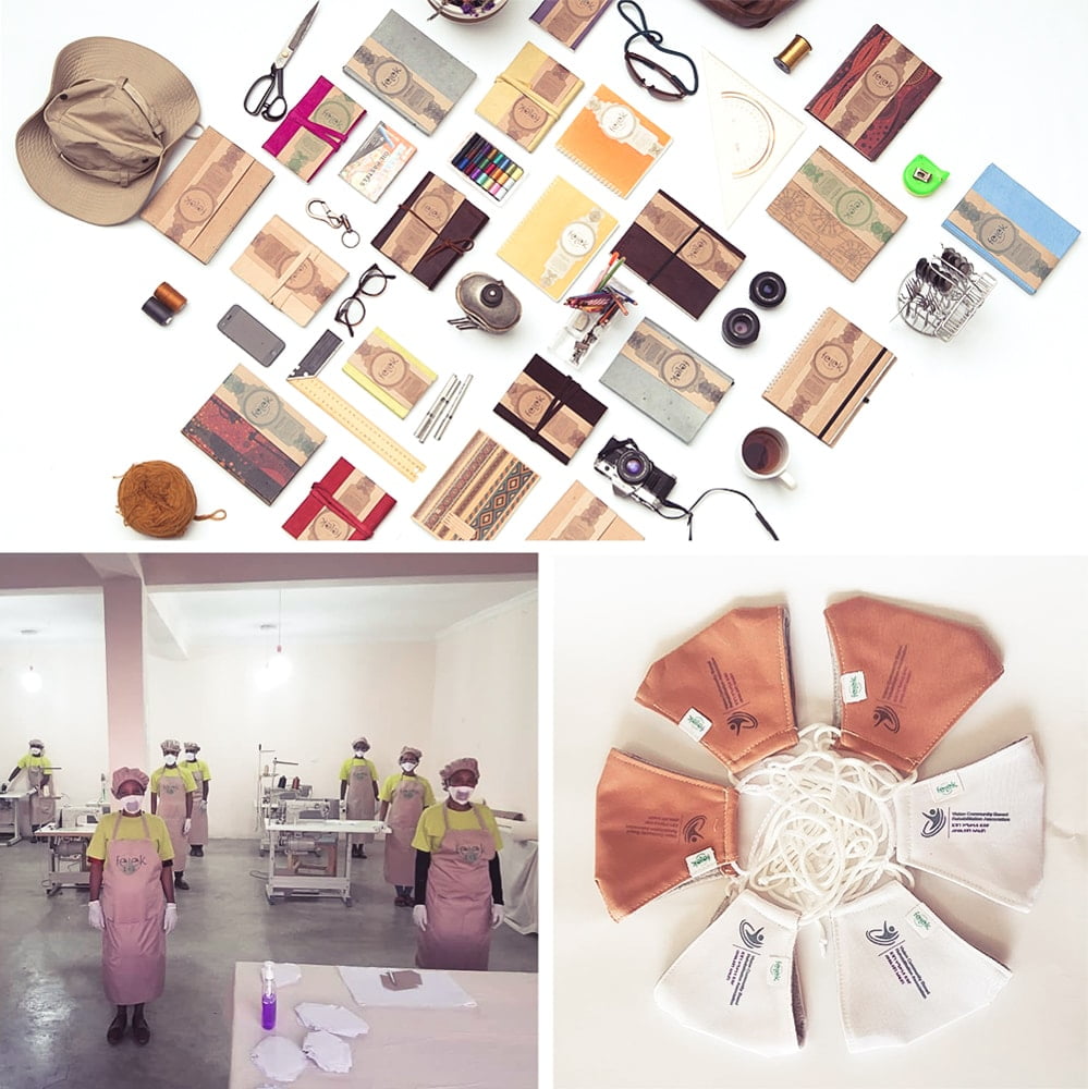
A brand’s audience isn’t just external — especially during a crisis like COVID-19 when the internal team is searching for answers. Because a strong brand unifies an organization around a common cause and acts as a catalyst for change. An example of a brand in action is Ethiopian locally-led social enterprise, Felek Notebooks.
When the pandemic hit and sales plummeted, they pivoted overnight to produce masks and save their 13 manufacturing jobs. And instead of distributing exercise books to vulnerable schools like normal, they created a new line of self-learning materials — maintaining their beneficiary impact of more than 2,000 students. All the while not compromising critical brand pillars like their reason, mission, and vision.
A round of applause please…
Congratulations to these changemakers doing incredible work. To everyone else, keep it up in 2021. And if you have early nominees for next year’s Social Venture Brand Awards, we’re all ears.
Read more articles
Ready to get fundable and findable?
We engage three ways: consulting, training, and field building.

