Our new visual identity & brand character: the fighter Sage.
Elevated Mighty Ally branding for an evolved brand strategy

KEVIN L. BROWN
Welcome to the new Mighty Ally identity. An evolution, not a revolution. Where the mindful, connected Sage brand character unites with our client heroes. Together — fighting poverty and injustice.
This visual identity system is the result of countless imperceptible positioning tweaks since we launched in 2017. Constant learning, listening, and applying insights. Plus months of marrying our latest brand strategy with pixel-perfect design.
To the outside world, it’s a new website with revised logo, colors, fonts, and iconography. But it’s more than a new plaster, as the exterior of any brand should be based on a solid interior. While brand strategy greatly influences visual and verbal identity, this work is much more than just style or personality.
See what has changed at Mighty Ally and why, including takeaways for your own social venture.
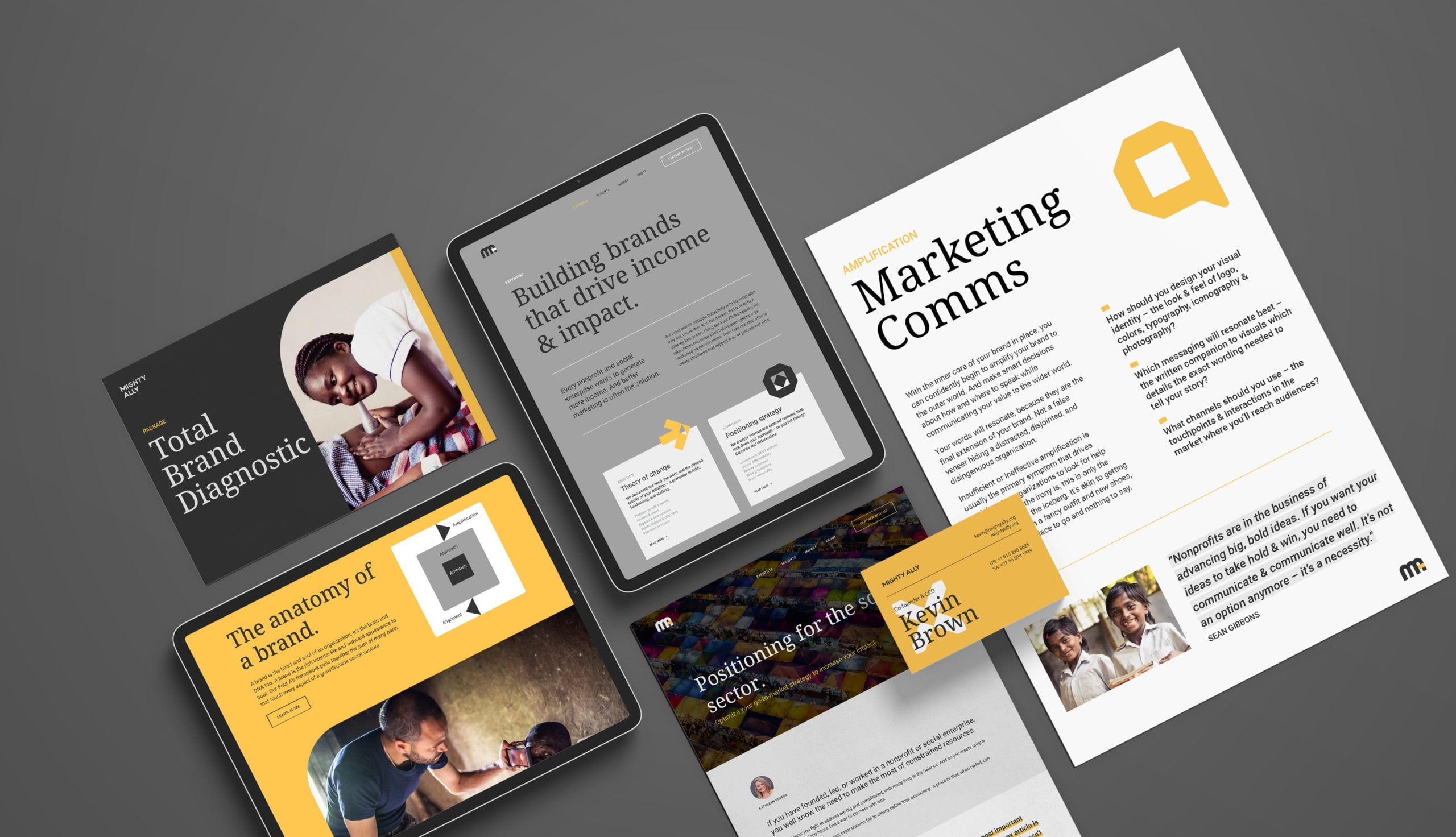
Our evolved brand strategy, with learnings for all.
Brand strategy is also a process, not an event. At Mighty Ally, we operate with a Kaizen-like philosophy of continuous improvement. Or micro-victories: the opposite of “death by a thousand cuts.” Meaning, we’re always recalibrating our own theory of change, positioning strategy, and marcom for the better.
It was high time to step back, and use our own Fundable/Findable Framework to reevaluate the Mighty Ally brand. Read on for what we learned.
Theory of change
The bulk of our own theory of change has held firm over the years. Including an intense focus on our most important result: helping clients drive more income. And the problem we’re solving is the same as always: only one in 1,000 social ventures will scale.
But the people group within that problem has diversified. We launched our nonprofit training arm in 2020, to train early-stage nonprofits. Whereas our consultancy guides larger growth-stage social ventures. We’re often building more developed brands for these slightly larger organizations. So we wanted our own branding to match their sophistication.
Not to mention, we’ve renamed and updated a couple of our disciplines, all based on listening to clients and ongoing landscape analysis. Our proprietary theory of change tool has replaced our former impact model — with improved workshop elements to determine an organization’s ambition. And strategic planning now sits as the centerpiece of our be fundable work — a popular template that turns vision into action. Best of all, each of the disciplines now has its own client workbook and one-page blueprint, to sum up the findings and put them in play.
Takeaways
Revisit your theory of change every year or two (best time: your annual strategic planning meeting).
Your reason for being and vision should stay firm over time. But other elements in your model might have shifted, like your mission. And your overall brand strategy might need a little shift too.
Positioning strategy
First, our priority audiences a few years back included our own individual donors. However, donations never materialized in our model outside of a few friendly supporters. On the other hand, project funding from foundations and high-net-worths became paramount to fuel our work. In fact, 83% of our largest engagements are sponsored by our clients’ major funders.
Second, our brand personality (character) matured as we grew. We started out as a Hero archetype, with Sage mixed in. As evidenced by our former visual identity being bold and energetic with a campaigning vibe. When we completed our own brand character exercise this year, we found Mighty Ally had become a heavy Sage brand. But we didn’t want to appear too cold and academic, or lose our edge. So we weaved in our “fighter” core value. Making our Sage a mix of wisdom, street smarts, and the unflinching willingness to take a stand for what’s right.
Takeaways
Positioning strategy is not a “set it and forget it” kind of document. You’re constantly learning more about your audiences, their pains and gains. And how your desired value propositions are landing, or not.
Update your positioning strategy annually, alongside your theory of change. And reflect any changes in your visual and verbal identity.
Marketing communications
We’ve been fortunate to not need concerted communications efforts — we’ve mostly grown via client referrals. But this new Mighty Ally branding accomplishes two goals in our marketing communications.
For one, we’ve prioritized the marketing channels of our blog and email newsletter to build our brand over time. Putting a lot of energy into writing thought leadership pieces and publishing free tools. So, our Insights page and email marketing were in need of a visual and structural overhaul.
Additionally, as our theory of change and expertise have evolved, we needed our comms to keep pace with the model. Instead of our Fundable/Findable Framework feeling like disjointed projects, we wanted to illustrate how these areas are inextricably the pillars of a brand. But we lacked visual devices to tell that story. Thus, the new iconography you’ll see below.
Takeaways
You can do great work — and create big impact — but if you’re not communicating well, it’s all for naught.
Look at your model for complexity that needs simplification. And seek outside advice to see where others don’t understand what you’re saying or doing. Then develop both visual and verbal solutions to your comms challenges.
“The fighter Sage’s wisdom comes from both the experience of doing and the pursuit of learning. Not an aloof academic in an ivory tower, but a student of the world around her. She uses her gifts of reason and analytics to discover the truth and share keen insights with others. Unlike distant intellectuals, this variety of Sage doesn’t hesitate to engage with the messy or mundane. She knows the truth is sometimes worth fighting for. Not content to just impart knowledge, she’ll hustle her way to the heart of the matter, and advocate for justice.”
Our new look.
With the refreshed brand strategy in hand, here’s how the new visual identity system came to life.
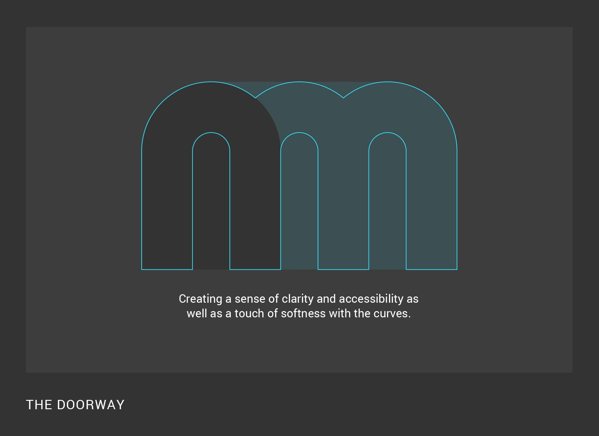
Logo

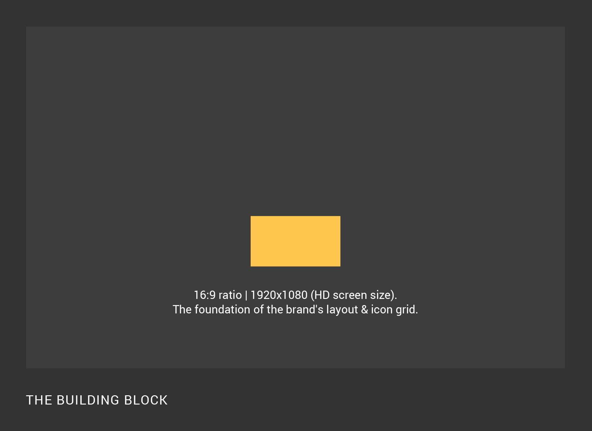
Core shapes
Iconography
Based on the logo building block, a custom device to illustrate our Fundable/Findable Framework disciplines. An arrow for theory of change. A target for positioning strategy. The speech bubble for marcom. And cross hairs for strategic planning.
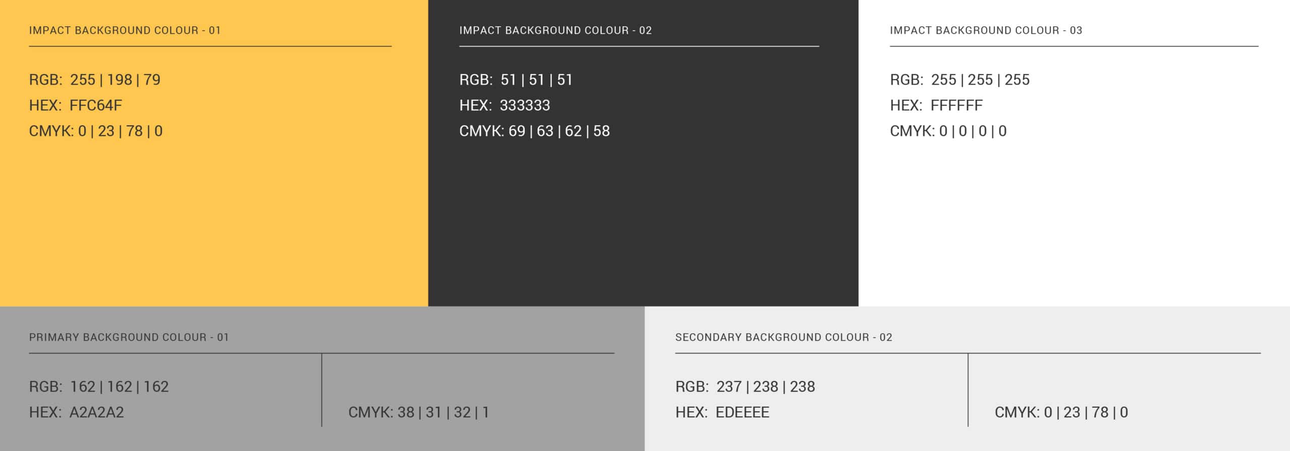
Color
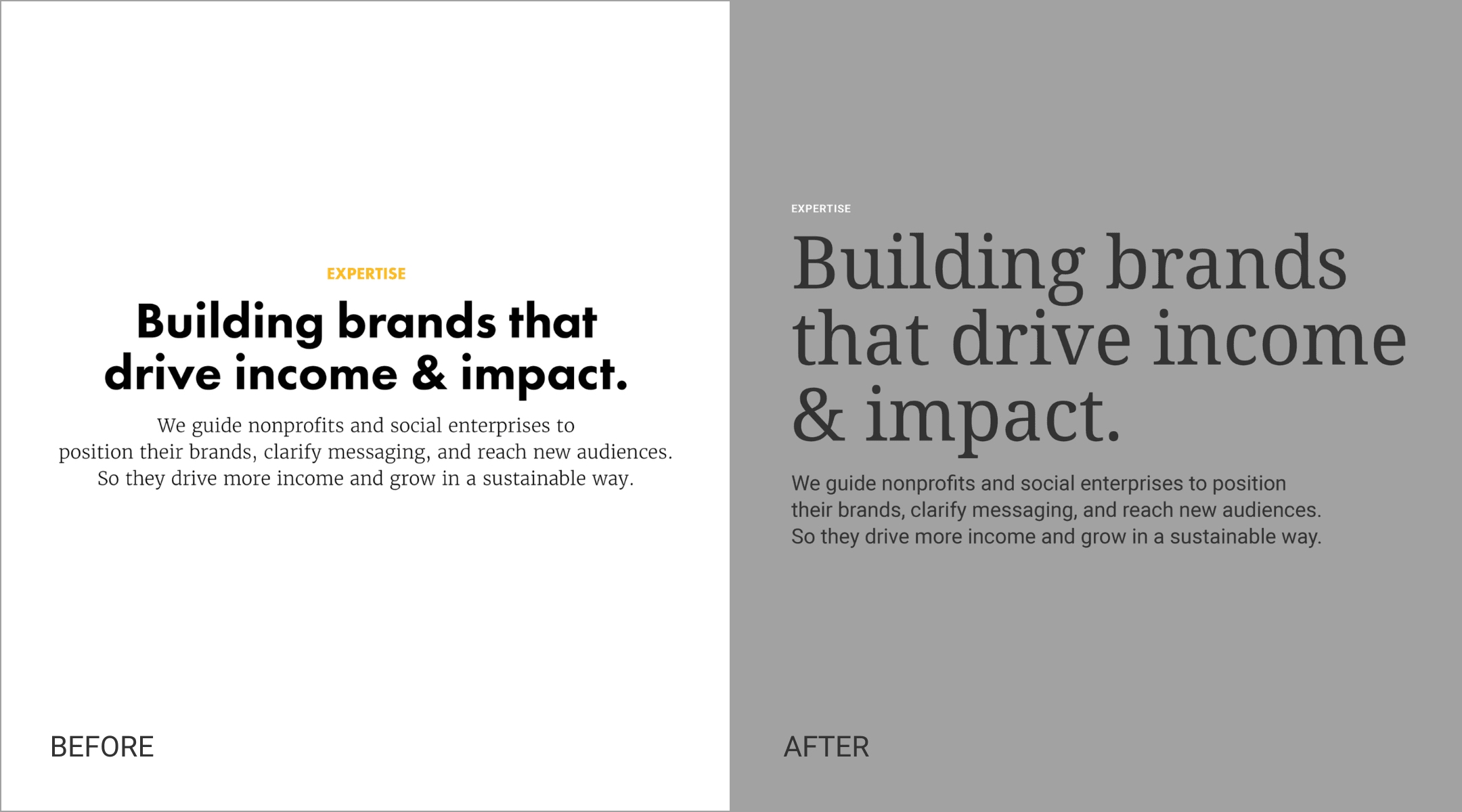
Typography
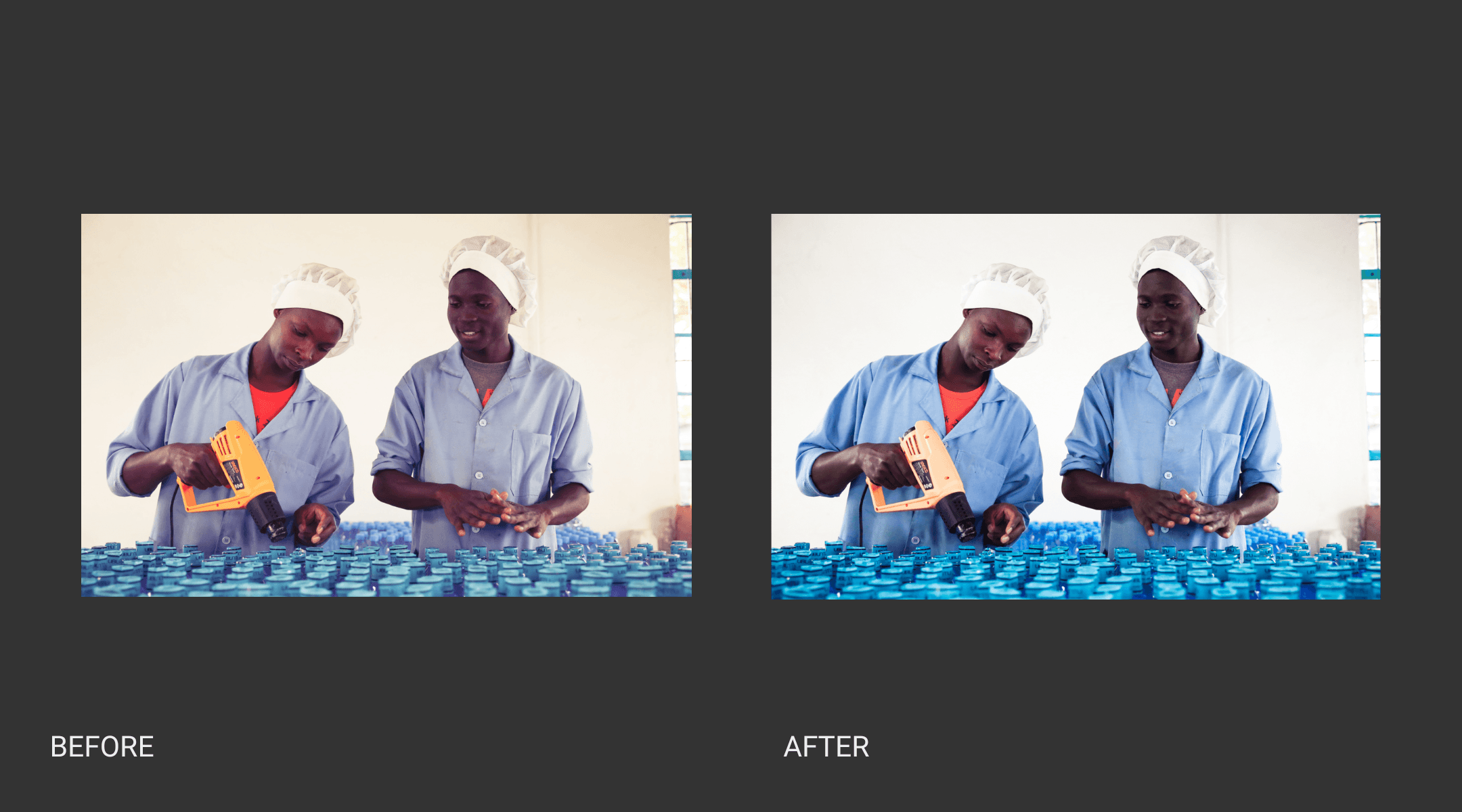
Photography
A final note on the process of rebranding.
You might think you don’t have the time or money to build a strong, beautiful brand. Don’t be foolish. But a rebranding project does start with strategy — long before creative. As they say: garbage in, garbage out. So don’t expect compelling visuals if you’ve not first armed your designers with clear briefs.
With a firm brand strategy, great design resources can be found the world over. From services like Catchafire and Taproot Foundation to Upwork and Fiverr, plus freelancers in every city around the globe. You can do it.
Huge props to our talented and tireless creative ally on this rebrand – South Africa’s own Mike van Heerdan at MVH Design Studio.
Read more articles
Ready to get fundable and findable?
We engage three ways: consulting, training, and field building.
